Tuesday, December 14, 2010
Adsessed
I am a bit "ADsessed", as my second year advertising and communication prof so lovingly dubbed me. I am amused, shocked, disgusted and bored half to death on a daily basis- with the ads that cross me. Underground, above ground, at the gym, in the office. Hit or miss, I eat them up. So here's what I think.
For the next few weeks, I will feature a series of ads I consider to be "good" (effective, witty, wise, interesting, well placed), and ads I consider to be "poor" (boring, lame, ineffective, poorly placed)
Feel free to comment- agree or disagree, I appreciate all feedback and conversation.
For the next few weeks, I will feature a series of ads I consider to be "good" (effective, witty, wise, interesting, well placed), and ads I consider to be "poor" (boring, lame, ineffective, poorly placed)
Feel free to comment- agree or disagree, I appreciate all feedback and conversation.
Tuesday, November 2, 2010
Lancome Hologram Ad

My initial thoughts upon flipping this hefty page in Elle Canada’s magazine were: excessive, eye catching, enthusiastic, futuristic, bizarre. I pull the card from the page, play with the clear tack adhesive, flip the card over and realize it does serve some sort of wild purpose. It is in fact, a ticket. A ticket that invites you, the magazine purchaser, to an event you will not likely attend. An event that will likely be over by the time you find said magazine on a rack at your local gym, under a seat on a subway, or sitting on a glass table in your dentist’s waiting room.

The ticket ad is a structured hologram that flashes messages “Never so Simple”, and then “Never Messy”. I can only assume the relevance of the hologram is to represent their claim to provide a "pixel precise complexion". I’m fairly certain the ad itself could double as a weapon. Sharp, sturdy edges that could inflict a paper cut worthy of stitches. The actual device (a small soft cushion that vibrates the powder foundation on) looks neat. Personally, I try to avoid powder foundation and new vibrating products at all costs, but this ad almost makes me consider checking it out.
I saw Lancome's ad for the first time about a month ago. The fact that I remember it is a good sign. That being said, I have never personally used the product. But this lovely lady has: CLICK for product review
I dig it, but still:
6.9
Wednesday, October 13, 2010
I must apologize in advance for the terrible photo quality. 90% of the pictures I plan on posting were taken about 24 minutes into my daily (yeah right) elliptical routine. All of them taken by my trusty Iphone, and all of them mid-stride.
I know what I like in an ad. I know it instantly. Though it’s much harder to explain what I don’t like. Bear with me.
Victim number one:

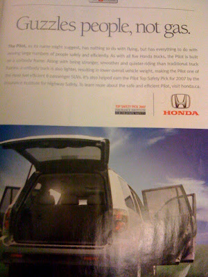
Effectively displays the vehicle, yes- Epic paragraph and all.
Effectively generates instant *yawn*, yes – that too.
However, I think the common looking content is slightly overridden by the charming play-on-words heading, “Guzzles people, not gas”. Clever, right?
Perhaps it is my interest in the environment that keeps attention (because a 4 door family-friendly SUV sure doesn’t.)
I give you a 6.5
I know what I like in an ad. I know it instantly. Though it’s much harder to explain what I don’t like. Bear with me.
Victim number one:

Effectively displays the vehicle, yes- Epic paragraph and all.
Effectively generates instant *yawn*, yes – that too.
However, I think the common looking content is slightly overridden by the charming play-on-words heading, “Guzzles people, not gas”. Clever, right?
Perhaps it is my interest in the environment that keeps attention (because a 4 door family-friendly SUV sure doesn’t.)
I give you a 6.5
Wednesday, August 4, 2010
Anti-aspartame

While I'm more than positive the aspartame filled life I lead will eventually catch up to me in one way or another- I simply cannot stop. Sure I have toned down the daily Silhouette 0% fat, 0% sugar, 100% bliss yogurts and substituted diet coke for soda water as a mix but surely that is not enough. Anything that sounds too good to be true, simply is.
I recently came across an ad I absolutely adore. It hits home with those aspartame-addicts like myself.
Wednesday, June 23, 2010
Think About It

I have always believed that writing advertisments must be the second most profitable form of writing. The first, of course, is likely to be ransom notes...right?
The US Federal Trade Commission has introduced a video game to enduce the education of children about the harmful qualms of advertising. The goal: to assist them in making informed decisions.
Players are able to confront advertisements at every turn—bus stops, in magazines, and on TV. Whenever an ad appears, the player is encouraged to ask three questions: who is responsible for the ad, what is the ad actually saying, and what does the ad want me to do? Besides children, this multi-media campaign also involves parents and teachers by way of a curriculum, which includes sample ads and teacher training videos, to be used in classrooms and at homes.
I say, good start!
Friday, May 28, 2010
Monochromatic

In the process of transforming my delightfully Easter egg colored, high school-esq, yellow and violet bedroom, into a chic white-with-silver and crystal accent-creation. I figure, if I am going to get over the post-university slump Ive flung myself into, I might as well do it in style.
Step one- consult and expert. Thank you Ms Mackay: Check
Step two- purchase paint. - Two cans of "cloud white" left over from a design show, so I had them readjusted to a creamier "Dove White" as suggested by my consultant. 100$ saved: Check
Step three- Pay a visit to Homesense for lamps (2), pillows (never enough), and chandelier: No check
Step four - Move the endless amounts of stuff into the center of the room: Defiantly no check
Step five- Set up tape, and drapes, and PAINT: No check, no check, no check..any volunteers?
Monday, May 17, 2010
Banksy Hunting

Best Sunday yet. Scoped out some blogs and went on a treasure-style hunt. Treasure= Banksy graffiti art. We were incredibly successful, and ridiculously blissful on this sunny Toronto day.
What a treat.
Check it out, you won`t be disappointed: http://www.banksy.co.uk/
Friday, May 14, 2010
Confessions of an Advertising Woman
Hello, online-summer-Advertising course
My name is Rebecca.
As a private person, I have a passion for landscape, and I have never seen one improved by a billboard. Where ever prospect pleases, man is at his vilest when he erects a billboard. When I retire from Madison Avenue, I am going to start a secret society of masked vigilantes who will travel around the world on silent motor bicycles, chopping down posters at the dark of the moon.
How many juries will convict us when we are caught in these acts of beneficent citizenship?
Oh, my darling Mr. Ogilvy.
Friday, April 9, 2010
Subscribe to:
Comments (Atom)

